Studio Obvious
Nordic Culture Fund
Website DesiGN
Brand Identity
Nordic Culture Fund
Website design
Brand Identity
Nordic Culture Fund
Website design
Brand Identity
Since its inception in 1966 the Nordic Culture Fund’s operations have been built on the belief that art and culture are capable of taking the lead in building international and global networks that can help us understand and develop societies. The fund awards grants worth approximately DKK 28 million every year, supporting around 340 projects, with the mission to stimulate the development of artistic and cultural life in the Nordics, and create a flexible framework for new collaborations and initiatives across borders. The design process defined the team's goals for the new website, and developed a new site design that was aligned with their new strategy and could strengthen the fund's connection to its different audiences.
Since its inception in 1966 the Nordic Culture Fund’s operations have been built on the belief that art and culture are capable of taking the lead in building international and global networks that can help us understand and develop societies. The fund awards grants worth approximately DKK 28 million every year, supporting around 340 projects, with the mission to stimulate the development of artistic and cultural life in the Nordics, and create a flexible framework for new collaborations and initiatives across borders. The design process defined the team's goals for the new website, and developed a new site design that was aligned with their new strategy and could strengthen the fund's connection to its different audiences.
Since its inception in 1966 the Nordic Culture Fund’s operations have been built on the belief that art and culture are capable of taking the lead in building international and global networks that can help us understand and develop societies. The fund awards grants worth approximately DKK 28 million every year, supporting around 340 projects, with the mission to stimulate the development of artistic and cultural life in the Nordics, and create a flexible framework for new collaborations and initiatives across borders. The design process defined the team's goals for the new website, and developed a new site design that was aligned with their new strategy and could strengthen the fund's connection to its different audiences.
Point of Departure


Before articulating where an organisation is going we need to define where they are at. With the Nordisk Kulturfond team we ran a workshop where we defined pain points, sweet spots and opportunities of their current website. Only when we had reached a clear understanding in that regard we moved on to define the team’s vision for the new site and what success for this project would look like. In this process it crystallised itself quite early that the current identity needed to evolve in order to be able to refelect the new strategy in their communications.
Point of Departure
Before articulating where an organisation is going we need to define where they are at. With the Nordisk Kulturfond team we ran a workshop where we defined pain points, sweet spots and opportunities of their current website. Only when we had reached a clear understanding in that regard we moved on to define the team’s vision for the new site and what success for this project would look like. In this process it crystallised itself quite early that the current identity needed to evolve in order to be able to refelect the new strategy in their communications.
Accessible Website design


Together with the development team we created an highly automated yet flexible website framework that allows the team to create versatile editorial and visual storytelling. The site received 499 out of 500 possible points for accessibility by the Danish Agency for Digital Government.
Accessible Website design
Together with the development team we created an highly automated yet flexible website framework that allows the team to create versatile editorial and visual storytelling. The site received 499 out of 500 possible points for accessibility by the Danish Agency for Digital Government.
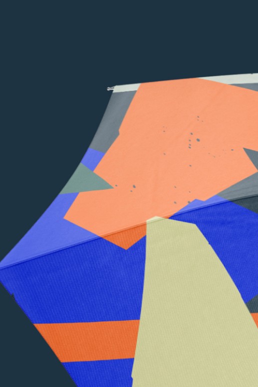
Graphic elements

Nordic Culture Fund was missing a visual language to complement their written voice. As the Fund operates on a high level and not always has imagery to accompany their communications, we developed a illustrative universe built on the marrying elements of nature and human made shapes into a weightless pattern. A rich colour palette adds depth and character to the brand.

Graphic elements
Nordic Culture Fund was missing a visual language to complement their written voice. As the Fund operates on a high level and not always has imagery to accompany their communications, we developed a illustrative universe built on the marrying elements of nature and human made shapes into a weightless pattern. A rich colour palette adds depth and character to the brand.
Brand applications


While the fund’s re-freshed identity is visually rich and versatile it’s actually very straight forward to use in day to day life. As a public organisation it was essential to the fund’s team that internal templates were aligned with the new brand and that its specifications were documented in a brand guide.
Brand applications
While the fund’s re-freshed identity is visually rich and versatile it’s actually very straight forward to use in day to day life. As a public organisation it was essential to the fund’s team that internal templates were aligned with the new brand and that its specifications were documented in a brand guide.
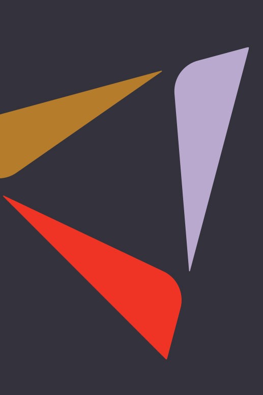
One of the big topics during our discovery phase with the team was the wish to challenge the definition of the term Nordic, inviting local and global artists to embrace it as something which is constantly in flux and without borders. The concept of the graphic element in the old visual identity centered around vertical direction. We gave it the capability to be flexible and function as an open framework that could integrate in a more versatile way with the fund’s communications.


One of the big topics during our discovery phase with the team was the wish to challenge the definition of the term Nordic, inviting local and global artists to embrace it as something which is constantly in flux and without borders. The concept of the graphic element in the old visual identity centered around vertical direction. We gave it the capability to be flexible and function as an open framework that could integrate in a more versatile way with the fund’s communications.
One of the big topics during our discovery phase with the team was the wish to challenge the definition of the term Nordic, inviting local and global artists to embrace it as something which is constantly in flux and without borders. The concept of the graphic element in the old visual identity centered around vertical direction. We gave it the capability to be flexible and function as an open framework that could integrate in a more versatile way with the fund’s communications.


For: Re: Cph
With: Today Studio
Coding: Re: Cph
For: Re: Cph
With: Today Studio
Coding: Re: Cph
For: Re: Cph
With: Today Studio
Coding: Re: Cph
RELATED CASES
SMK
OPEN
Upgrading the online collection of Denmark's National Gallery.
UX/UI Design
Website Design
Digital Design
CBMR
Innovation
summit
A visual identity for an event connecting academia and industry to drive innovation in metabolic health.
Visual Identity
Event Identity
Brand System
Ancient
Genome
Atlas
A digital tool mapping human migration via ancient genome finds.
UX/UI Design
Website Design
Digital Design
Stop by
Studio Obvious
Flæsketorvet 28
1711 Copenhagen
Denmark
Let's connect
The obvious bi-annual newsletter
Stop by
Studio Obvious
Flæsketorvet 28
1711 Copenhagen
Denmark
Let's connect
The obvious bi-annual newsletter
Stop by
Studio Obvious
Flæsketorvet 28
1711 Copenhagen
Denmark
Let's connect
The obvious bi-annual newsletter